Identity verification should be one of those experiences you barely remember.
You provide an accepted form of identification, prove you are who you say you are, and continue with whatever you were trying to do.
LinkedIn even presents the process with an appealing promise: verify in two minutes.
My experience was slightly different.
What began as an attempt to create a LinkedIn Company Page turned into a journey across LinkedIn, Persona, OneID, Monzo and another identity provider — ultimately ending on a generic error page with no meaningful recovery path.
The interesting part wasn't simply that something broke.
Software breaks.
The interesting part was how the design of the overall journey made it unnecessarily difficult to understand:
- what forms of identification were actually supported;
- which company was responsible for each part of the process;
- whether verification had succeeded;
- where the failure occurred;
- and what I was supposed to do next.
It became a useful example of how individually polished interfaces can still combine into a poor end-to-end user experience.
The original task was simple
I wanted to create a LinkedIn Company Page.
Instead of being allowed to continue, LinkedIn required me to verify my identity first.
That's not inherently unreasonable. Company Pages can represent real businesses, so adding some friction to prevent abuse makes sense.
The problem began with how the available verification options were communicated.
The verification process referred broadly to government ID, initially making it appear that documents such as a driving licence might be suitable.
As a UK user with a provisional driving licence, that sounded promising.
It wasn't.
After selecting the United Kingdom, the process asked whether my document contained the biometric symbol normally associated with NFC-enabled identity documents.
Continuing into the flow revealed four options:
National ID, Passport, Share Code and OneID.
There was no driving licence option.
Already, the experience had created a mismatch between the user's expectation and the system's actual requirements.
“Government ID” isn't specific enough
This is a small piece of copy with surprisingly large consequences.
"Government ID" describes a category.
It does not tell the user which documents are accepted for this particular verification flow.
A UK driving licence is government-issued identification. A passport is government-issued identification. A residence permit may also qualify.
But that doesn't mean every verification provider supports all of them.
A better interface would therefore communicate the requirement before the user begins:
Verify your identity
UK members can currently verify using:
- an NFC-enabled passport;
- a supported residence document;
- a government Share Code where applicable;
- or OneID bank verification.
That takes slightly more space.
It also eliminates an enormous amount of uncertainty.
Good UX often isn't about making an interface contain fewer words. It's about giving users the right information at the point where they need it.
An alternative appears: OneID
Fortunately, there appeared to be another option.
OneID.
OneID allows identity information to be verified using supported banking data, which meant I potentially didn't need a passport at all.
Great.
I selected OneID and chose Monzo.
At this point, the experience actually worked remarkably well.
OneID redirected me into Monzo.
Monzo explained what information would be shared and asked me to approve the request.
The authentication completed successfully.
“Oops — something went wrong"
The next destination was id.eideasy.com.
Instead of completing verification, it displayed:
Oops — something went wrong.
We couldn't process your request right now.
And that was effectively it.
There was a Case ID, but almost no useful explanation.
No indication of:
- which stage had failed;
- whether my information had already been submitted;
- whether I should retry;
- whether repeating the process could create problems;
- whether LinkedIn, Persona, OneID or another provider should be contacted;
- or whether there was an alternative route.
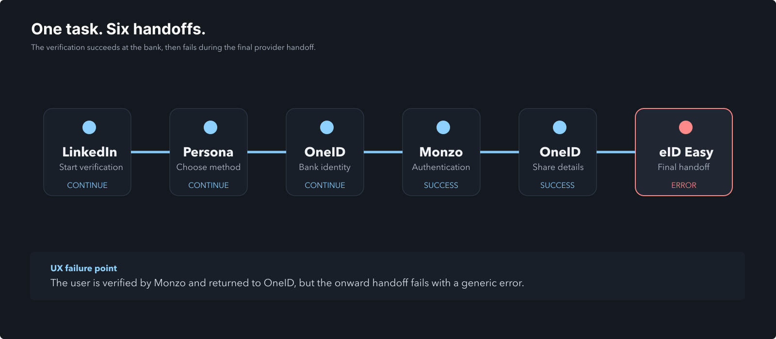
This is where the experience went from inconvenient to genuinely poor error recovery.
The subsequent troubleshooting eventually narrowed the failure down considerably: Monzo completed successfully, OneID received the identity information, and the error happened after selecting Share, during the onward provider handoff.
That information should not require a user to manually reverse-engineer the verification architecture.
Monzo then displayed an “All done!” confirmation.
I returned to OneID, where the identity information supplied by the bank was displayed.
I selected Share to continue.
For a moment, it looked like the verification had worked.
Then I was redirected again.
Error messages are part of the product
Generic errors are tempting.
Something unexpected happened, so the interface displays:
Something went wrong.
From an engineering perspective, that may be technically accurate.
From a user perspective, it communicates almost nothing.
A useful error state needs to answer at least three questions:
- What happened?
- What happens to the information I already submitted?
- What can I do next?
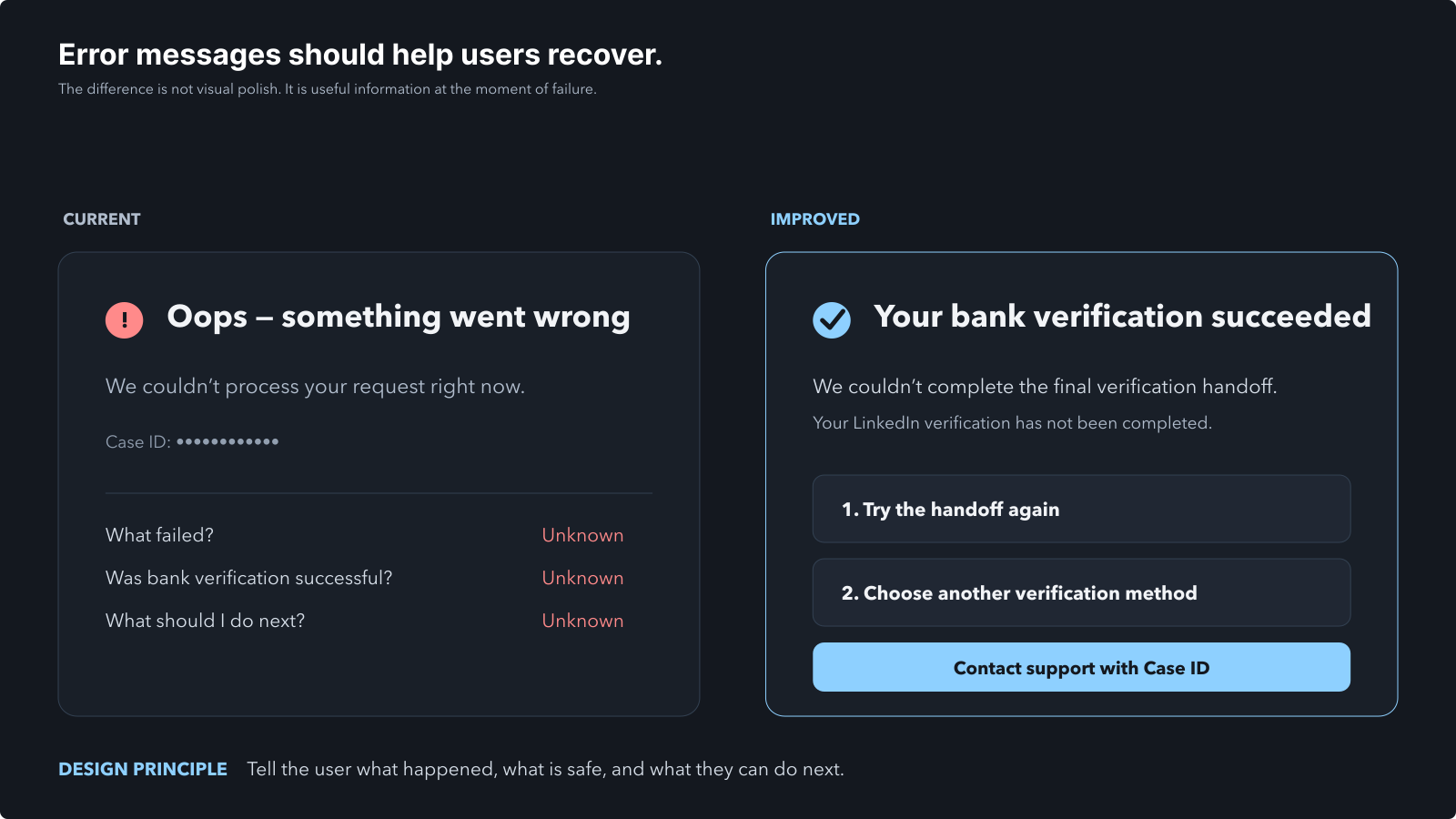
Even something as simple as this would have been dramatically better:
We couldn't complete your verificationYour bank verification was successful, but we couldn't transfer the result to our verification partner.Your LinkedIn verification has not been completed. Try again, choose another method, or contact support using Case ID XXXXX.
Suddenly the user has a mental model.
They know their bank isn't the problem.
They know verification isn't complete.
They know whether retrying makes sense.
And they know where the Case ID is useful.
The difference is a handful of sentences.
Then support contradicted itself
With the verification route failing, I turned to LinkedIn's Help Assistant.
I asked whether a UK provisional driving licence was accepted.
The initial response was clear:
“Yes. A UK driving licence (including provisional) is an accepted government ID type for Persona-based identity verification…”
It even provided instructions telling me to choose Driver's licence from the verification flow.
There was one problem.
That option did not exist.
When I explained the actual choices presented to me — National ID, Passport, Share Code and OneID — the answer changed:
“With the options you're seeing, your UK provisional driving licence unfortunately can't be used in that specific Persona flow.”
A few messages later the assistant clarified that, in my specific UK flow, provisional driving licences were not accepted and listed an NFC-enabled passport, residence permit or the other available UK-specific routes instead.
This demonstrates another important UX principle:
Support is part of the user experience
It's easy to treat support as something separate from product design.
It isn't.
When the normal interface fails, support effectively becomes the interface.
At that moment, users depend on it to rebuild their understanding of the system.
Contradictory guidance is therefore particularly damaging.
The problem wasn't simply that the first answer was wrong.
The problem was that the incorrect answer sounded highly confident and included detailed instructions.
Had I assumed it was authoritative, I could have wasted considerably more time looking for a driver's licence option that was never going to appear.
An AI support system should be particularly careful when there are multiple verification contexts with different rules.
“Persona accepts driving licences” and “this LinkedIn Persona configuration accepts driving licences” are not necessarily the same statement.
Context matters.
Too many providers, too little continuity
By this point the journey involved something resembling:
LinkedIn → Persona → OneID → Monzo → OneID → external identity provider → error
There's nothing inherently wrong with using specialist third-party providers.
Identity verification is complicated, regulated and security-sensitive. Integrating established providers can make far more sense than building everything internally.
But from the user's perspective, it should still feel like one coherent journey.
Instead, every handoff introduces questions:
Who has my information now?
Am I still completing LinkedIn verification?
Did Monzo verify me, or did it only verify something for OneID?
Why am I suddenly on another company's domain?
If this breaks, which company owns the problem?
The technical architecture shouldn't become the user's responsibility.
A strong integration hides organisational complexity behind a consistent experience.
A weak integration exposes the seams.
Trust matters even more in identity flows
This problem becomes especially important because identity verification isn't an ordinary checkout or signup process.
Users are being asked to share highly sensitive information.
That means every unexpected redirect, ambiguous message and unexplained third-party domain places additional pressure on trust.
The interface should constantly reinforce:
- who is requesting the information;
- why they need it;
- who it will be shared with;
- what happens next.
OneID actually handled part of this quite well by showing the information received and asking for explicit consent before sharing it.
The overall journey failed because that clarity didn't survive the next handoff.
The happy path isn't the whole experience
“Verify in two minutes” may very well be accurate for someone who:
- has the expected passport,
- has NFC enabled,
- scans it successfully,
- passes every automated check,
- and never encounters an integration error.
That's the happy path.
But product quality is often revealed outside the happy path.
- What happens when someone doesn't own the preferred document?
- What happens when an alternative verification method fails?
- What happens when a third-party service returns an error?
- What happens when support documentation describes a broader set of IDs than the actual configured flow supports?
Those edge cases are still the product.
In my case, LinkedIn's eventual guidance was to contact Persona because the failure occurred within the external verification chain. The support assistant specifically requested that the Case ID, UK location, OneID/Monzo route and id.eideasy.com error be supplied.
That is useful guidance.
It just arrived after the user had already diagnosed most of the problem themselves.
How I would redesign it
I wouldn't radically redesign the visual interface.
Most of the individual screens are perfectly presentable.
I'd redesign the journey.
1. Show supported UK methods before verification begins
Don't make users discover document restrictions through trial and error.
Tell them exactly what works.
2. Explain third-party handoffs
Before leaving LinkedIn:
You'll complete verification securely with Persona. Depending on your chosen method, you may also be redirected to OneID and your bank.
Now unexpected redirects become expected ones.
3. Maintain progress across providers
Something as simple as:
- Choose method ✓
- Verify identity ✓
- Share verification ✓
- Confirm with LinkedIn
would give users a mental model that survives provider changes.
4. Design meaningful failure states
Errors should identify the stage that failed and provide contextual recovery actions.
Not:
Oops.
But:
Your bank verification succeeded, but we couldn't complete the final verification handoff.
5. Make support context-aware
If LinkedIn knows which identity flow the account has been assigned, its support assistant should answer questions using that exact configuration.
Not generic documentation from adjacent verification processes.
6. Provide an escalation path
When an integrated provider fails repeatedly, users shouldn't have to discover which vendor supports which part of the stack.
A single “Get verification help” action should capture the relevant provider, stage and Case ID automatically.
The larger lesson
The most interesting lesson from this experience is that none of these problems require spectacular visual redesigns.
- The interfaces mostly looked clean.
- The buttons worked.
- The typography was readable.
- The layouts were modern.
- Yet the experience still failed.
That's because UX is not synonymous with UI.
A product can have polished screens while providing a confusing product experience.
The real design exists in the relationships between those screens:
- the expectations you create,
- the information you reveal,
- the transitions between systems,
- the recovery paths when something goes wrong,
- and the confidence the user retains throughout the journey.
“Verify in two minutes” is an excellent promise when everything works.
When it doesn't, those two minutes can become a surprisingly good UX case study.